Making sense of changes in ordinal variables can be hard.
bayes
analysis
Published
July 23, 2021
Summary
A few weeks ago I tweeted out a plot that was my attempt to visualize the relationship between a covariate or predictor and an ordinal outcome (a challenge I often struggle with!). Since some people asked, I thought it’d be a good opportunity walk through the modeling and plotting process, with a focus on the latter.
But first, acknowledgments are in order: I already mentioned this in the tweet, but all of this is heavily inspired by Richard McElreath’s excellent Statistical Rethinking, quite possible the best introduction to Bayes and statistical reasoning out there. If you’re more familiar with the tidyverse, Solomon Kurz’s translation of McElreath is a must. I relied on it heavily as an introduction to cumulative models in brms. I also make use of the tidybayes / ggdist packages by Matthew Kay. I encourage everyone to check the vignettes for extra thoughts on visualizing ordinal outcomes.
My sense is that we often don’t know what to do with ordinal variables, partly because they don’t fit neatly into traditional analysis routines. Ordinal variables are not numeric, they’re not categorical, they’re strange. As Torrin Liddell and John Kruschke pointed out in a great review paper, the most common way of analyzing ordinal data is to just assume it’s metric. In fact, they found that 100% (!) of the papers they surveyed analyzed ordinal data with metric models. And this is problematic.
Why? That’s out of the scope of this blog post, but treating these variables as metric can lead us to find effects where there are none, to find no effects where we should find them, and to even flip the sign of an effect. Treating ordinal variables like they’re numeric assumes that they represent regular intervals. Imagine we’re using a Likert scale that looks like this:
Either something is true or it is false; there is nothing in-between.
Strongly disagree
Disagree
Neither agree nor disagree
Agree
Strongly agree
If we code this variable as metric (on a 1-5 scale), we are assuming that the difference between Strongly disagree and Disagree (1 and 2) is the same as the difference between Neither agree nor disagree and Agree (3 and 4). Now, this could potentially be true, but there’s no reason to believe it is, since the numbers we assigned to the scale are just markers of ordering, nothing more. Assuming they’re intervals is a very strong assumption! To see why, imagine we asked people the following question:
How often do you feel sad?
Never
Sometimes
Often or very often
Should we believe the change between Never and Sometimes is the same as the change between Sometimes and Often or very often? Probably not. This is a contrived example, sure. But it shows that we should be careful about systematically assuming that ordinal data is equivalent to numeric data.
A more appropriate tool for this sort of problem is an ordinal models, of which there are quite a few available; the most common are the cumulative,sequential, and adjacent-category models We won’t get into this, but if this interests you, you can take a look at this paper by Paul Bürkner and Matti Vuorre, which is a great overview from a Bayesian perspective.
Visualizing ordinal data
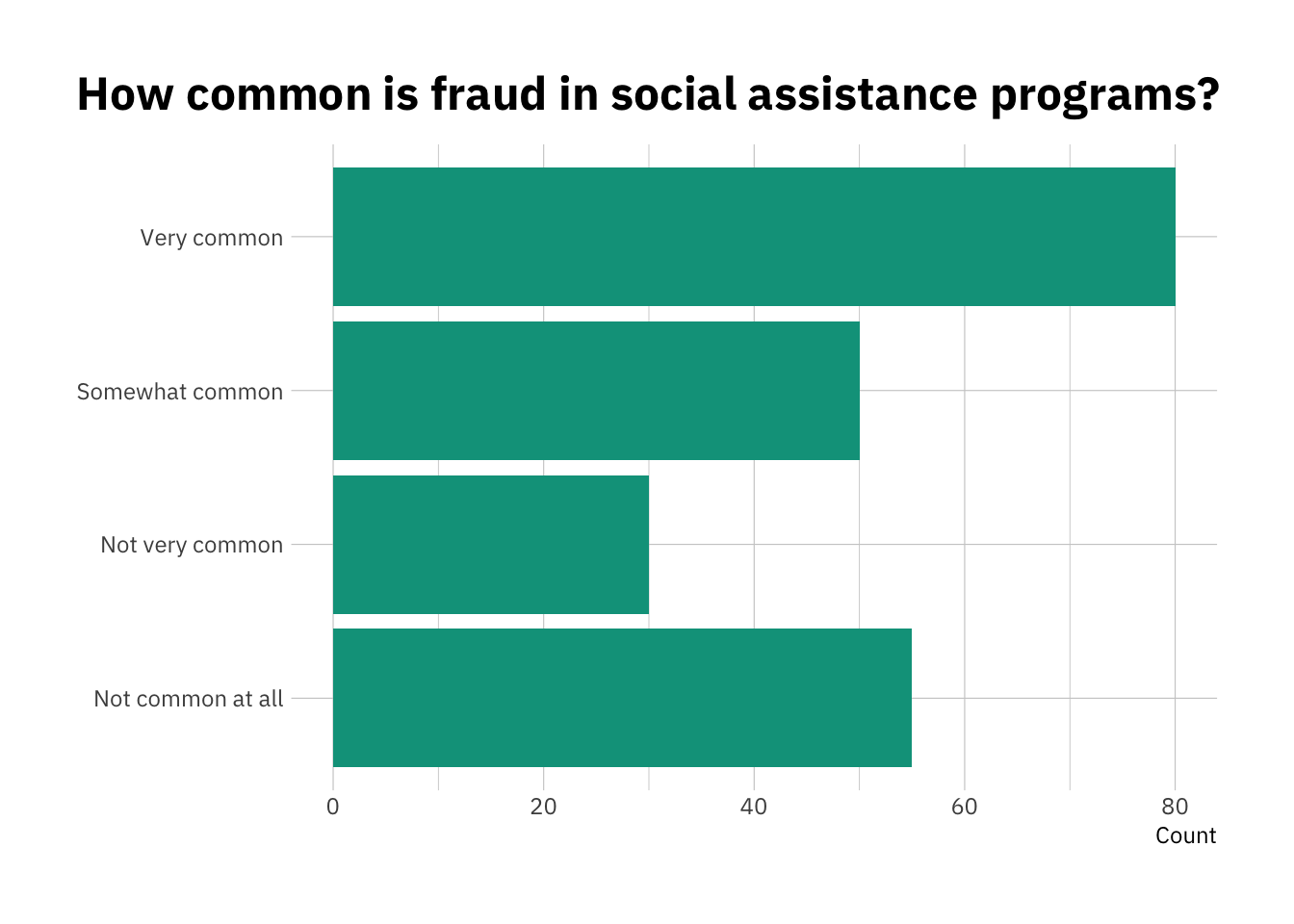
But enough of modeling assumptions. I find that ordinal data is also somewhat complicated to visualize whenever there’s any sort of change involved. Levels are straightforward to visualize. At the end of the day, we can use a simple bar chart to show the count or percentage of respondents who selected each of the options, and then order the bars accordingly:
library(dplyr)
Attaching package: 'dplyr'
The following objects are masked from 'package:stats':

    filter, lag
The following objects are masked from 'package:base':

    intersect, setdiff, setequal, union
library(ggplot2)library(hrbrthemes)my_labels <-c("Not common at all","Not very common", "Somewhat common", "Very common") level_df <-tibble(choice =c(1, 2, 3, 4),count =c(55, 30, 50, 80)) %>%mutate(choice =factor(choice, labels = my_labels))level_df %>%ggplot(aes(y = choice,x = count)) +geom_col(fill ="#00A08A") +labs(title ="How common is fraud in social assistance programs?",y =NULL,x ="Count") +theme_ipsum_ps() +theme(plot.title.position ="plot")
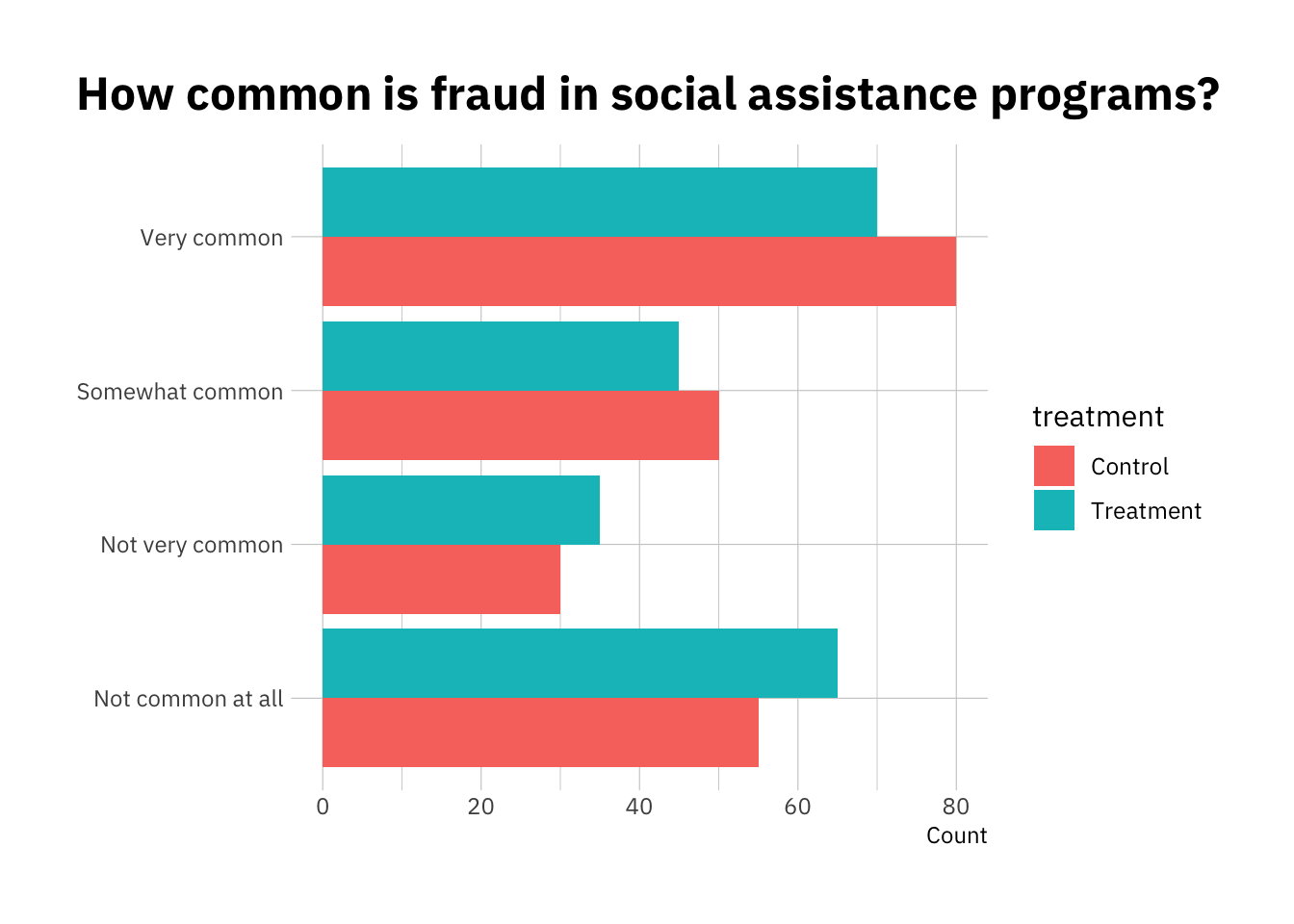
But imagine we wanted to show the effect of a treatment. A simple option is to just use a dodged bar chart:
It’s not bad, but it’s not super intuitive either. It also becomes problematic when working with continuous predictors, or with lots of different groups. Let’s walk through a simulated example to explore other options.
The question
My team at ideas42 has been running a bunch of surveys on attitudes towards poverty in the United States. This almost always involves ordinal outcomes, often in the form of Likert scales. One of our research questions is whether ideology (and specifically, authoritarianism and dominance orientation) is predictive of overall fraud perceptions across a bunch of social assistance programs (think SNAP, Social Security, and Medicare).
Since that was the topic of the original plot, we’ll stick to it, except this time we’ll simulate some fake data to make the results more reproducible.
Simulating the data
First, let’s load the extra packages we’ll need. Note we have already loaded dplyr, ggplot2, and hrbrthemes.
# Simulating data!library(simstudy)# Wrangling and plotting and labels!library(ggtext)library(ggrepel)# Bayesian modeling, extracting draws, etclibrary(brms)
Loading required package: Rcpp
Loading 'brms' package (version 2.22.0). Useful instructions
can be found by typing help('brms'). A more detailed introduction
to the package is available through vignette('brms_overview').
Attaching package: 'brms'
The following object is masked from 'package:stats':

    ar
library(tidybayes)
Attaching package: 'tidybayes'
The following objects are masked from 'package:brms':

    dstudent_t, pstudent_t, qstudent_t, rstudent_t
library(modelr)# Theminglibrary(viridisLite)
Let’s use the simstudy package to simulate some ordinal data. There’s a bunch of ways to do this (including by hand), but this package makes things significantly easier.
Let’s create 4 different levels, which we’ll assume to be a Likert scale ranging from Strongly Agree to Strongly Disagree. You can follow the code below, or skip it if you’re more interested in the modeling and plotting part of it.
To keep with our examples, we’ll also assume that there’s 5 different cases. We can assume these are government programs, and people respond differently to them. Some cause, on average, more positive reactions that others.
We’ll also assume (as we found in practice) that authoritarianism is predictive of general fraud perceptions. In our simulation, we’ll give it a coefficient of 0.3, so that every unit increase in authoritarianism is associated with a 0.3 unit increase in the latent fraud perception variable.
# Simulating our ordinal categorical data## Define our authoritarianism variable (mean = 0, sd = 1)def1 <-defData(varname ="auth",formula =0, dist ="normal", id ="id",variance =1)# Define our 5 different programs with equal probabilitydef1 <-defData(def1, varname ="program", formula ="0.2;0.2;0.2;0.2;0.2", dist ="categorical")# Define the continuous variable that sit below the ordinal outcomesdef1 <-defData(def1,varname ="z",formula ="0.3*auth + 0.2*program", dist ="nonrandom")
Now let’s generate the categorical response variable (choice) and the rest of the data.
We won’t dwell on the specifics of the simstudy package, but if you’re interested you should check out the vignettes available. There are also a number of case studies you may find helpful, including one on how to visualize ordinal treatment effects, or how to think about generating ordinal data.
## Generate dataset.seed(42)# Generate 1000 data pointsd <-genData(1000, def1)# Set probabilities for each of the levels - note the last one isn't necessaryprobs <-c(0.35, 0.3, 0.15)d <-genOrdCat(d,adjVar ="z", idname ="id", baseprobs = probs,catVar ="choice")
Warning: Probabilities do not sum to 1. Adding category to all rows!
Ok, we have our data. Let’s take a look at it to make sure that everything worked fine.
d %>%head() %>% kableExtra::kable(digits =2)
id
auth
program
z
choice
1
1.37
1
0.61
2
2
-0.56
3
0.43
1
3
0.36
1
0.31
1
4
0.63
3
0.79
3
5
0.40
5
1.12
3
6
-0.11
3
0.57
4
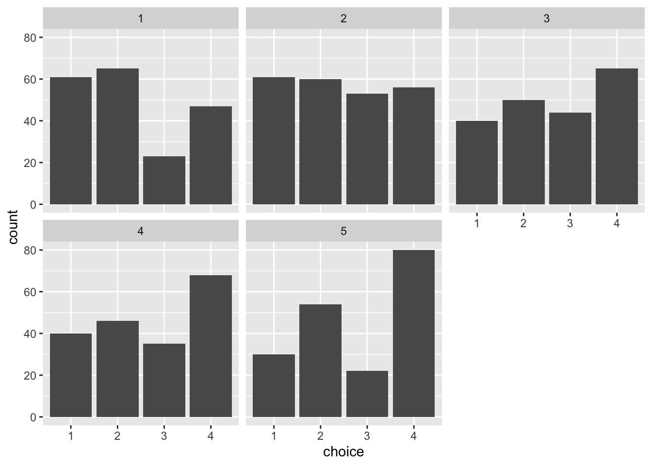
All good. To assess whether the distributions are representative of what we would see in real life, let’s plot our fake data.
d %>%ggplot(aes(choice)) +geom_bar() +facet_wrap(~program)
Looks fairly realistic, but let’s make it a bit nicer. We can flip the axes so that it’s easier to compare the levels, and also add the labels for each of the ordinal levels.
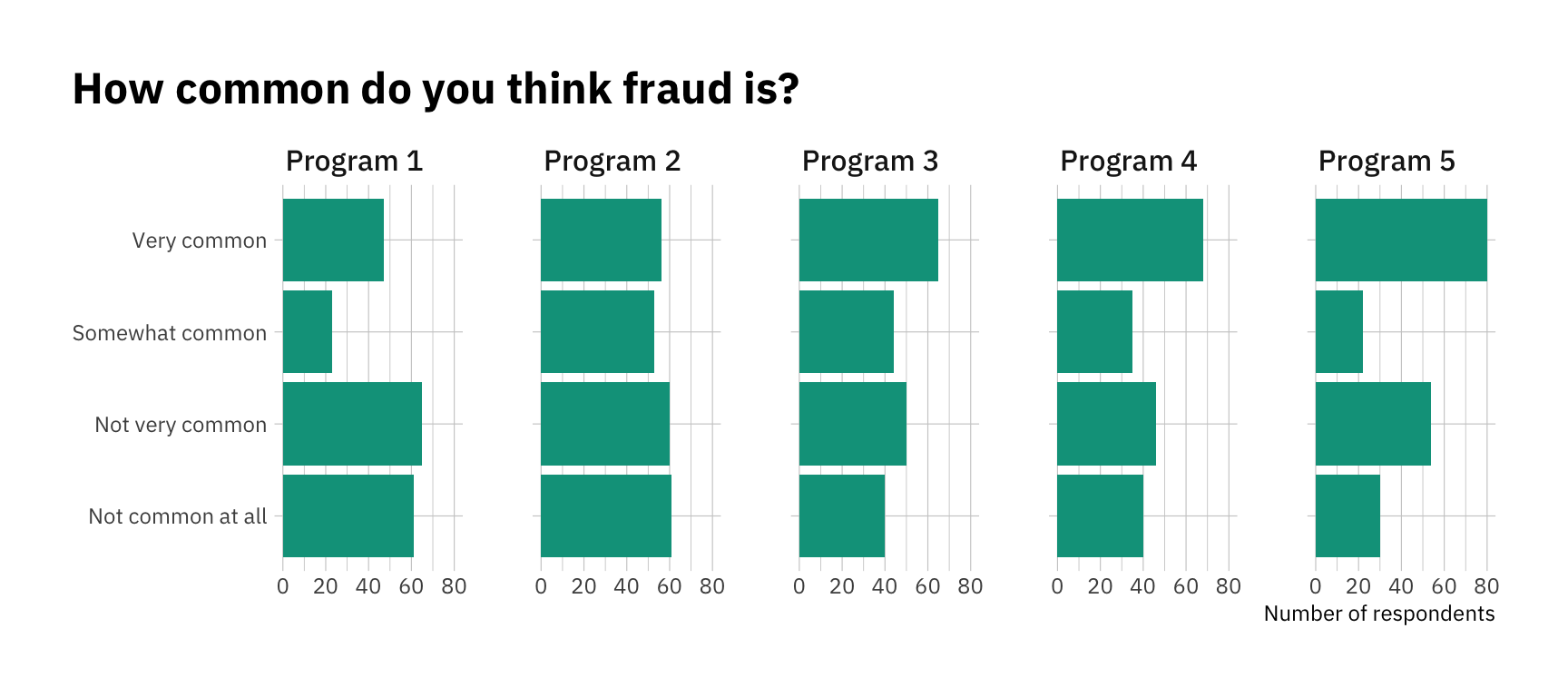
df <- d %>%# Generate labels for each programmutate(program =factor(program, labels =c("Program 1","Program 2","Program 3","Program 4","Program 5")),# Generate labels for each Likert categorychoice_lab =factor(as.numeric(choice), labels = my_labels, ordered =TRUE),# Generate a numeric version of the variable for our modelchoice_num =as.numeric(choice)) df %>%ggplot(aes(y = choice_lab)) +geom_bar(fill ="#00A08A") +facet_wrap(~program, nrow =1) +theme_ipsum_ps() +labs(title ="How common do you think fraud is?",y =NULL,x ="Number of respondents") +theme(plot.title.position ="plot")
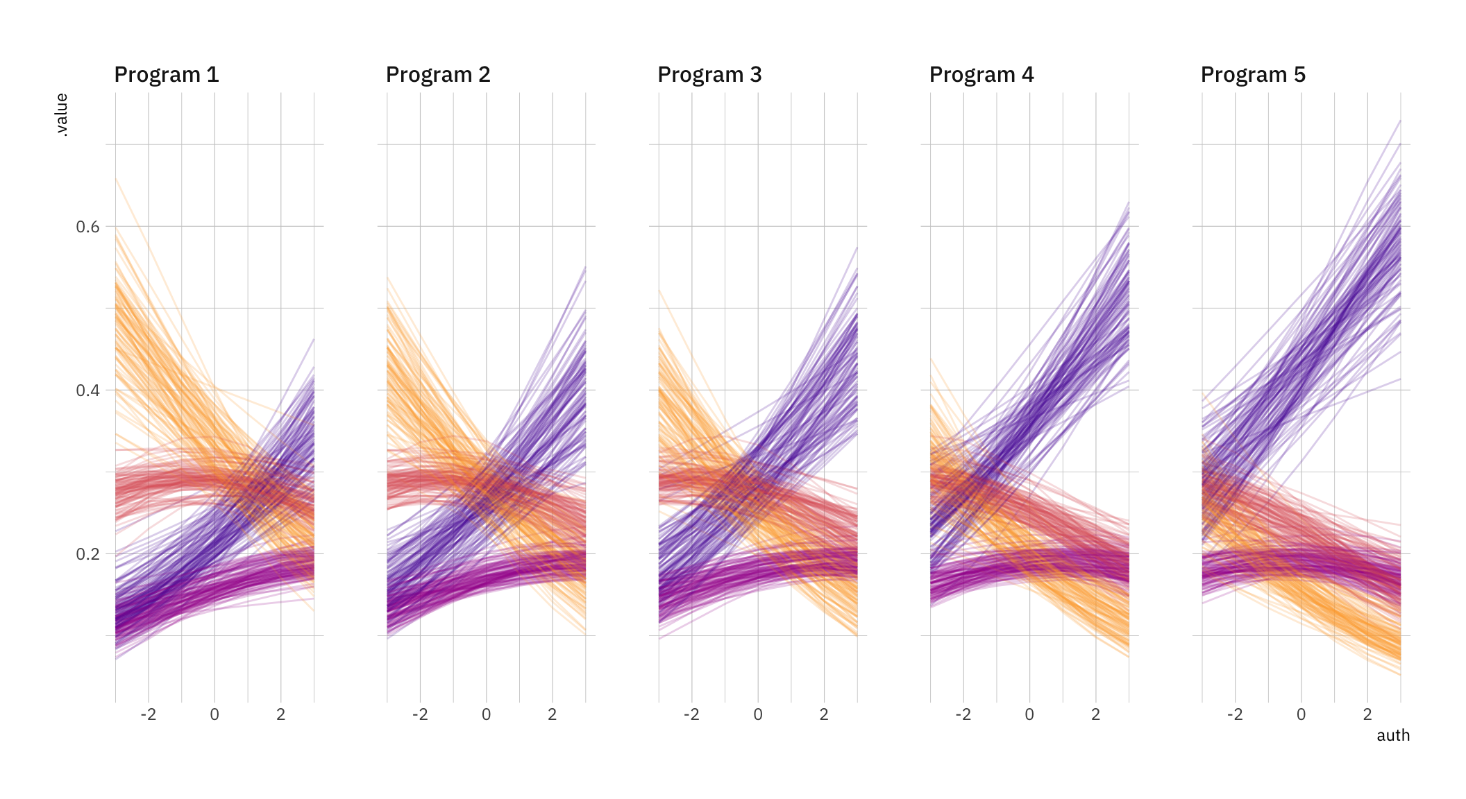
Ok, that looks good for now! As specified in our data-generating process, every program has a slightly different distribution. As we move towards the right, people are more likely to see fraud. Now that we have our data, let’s move on to modeling.
The model
We’ll use Bayesian methods because they’re far more flexible once you move beyond the basics. To do it, we’ll need the brms and tidybayes / ggdist packages. If you’re not used to Bayesian stats, there are bunch of Frequentist alternatives out there (for example, the ordinalpackage).
Note that the model may take a couple of minutes to compile and run. If this is your first time using brms, head to the great documentation and vignettes.
Here’s the model summary. Things look pretty good! You’ll see that the model managed to capture the right authoritarianism parameter, and it got pretty close to the real (simulated) program parameters too:
print(fit_brms)
 Family: cumulative
  Links: mu = logit; disc = identity
Formula: choice_lab ~ 1 + auth + program
   Data: df (Number of observations: 1000)
  Draws: 4 chains, each with iter = 2000; warmup = 1000; thin = 1;
         total post-warmup draws = 4000

Regression Coefficients:
                Estimate Est.Error l-95% CI u-95% CI Rhat Bulk_ESS Tail_ESS
Intercept[1]       -0.71      0.13    -0.97    -0.46 1.00     2826     2773
Intercept[2]        0.50      0.13     0.25     0.75 1.00     2541     2945
Intercept[3]        1.28      0.13     1.03     1.54 1.00     2518     3253
auth                0.21      0.06     0.10     0.33 1.00     4847     3062
programProgram2     0.23      0.18    -0.13     0.59 1.00     3107     3212
programProgram3     0.39      0.18     0.05     0.74 1.00     2740     3075
programProgram4     0.69      0.17     0.34     1.03 1.00     2686     3059
programProgram5     0.97      0.19     0.60     1.34 1.00     3354     3248

Further Distributional Parameters:
     Estimate Est.Error l-95% CI u-95% CI Rhat Bulk_ESS Tail_ESS
disc     1.00      0.00     1.00     1.00   NA       NA       NA

Draws were sampled using sampling(NUTS). For each parameter, Bulk_ESS
and Tail_ESS are effective sample size measures, and Rhat is the potential
scale reduction factor on split chains (at convergence, Rhat = 1).
Now let’s extract the model predictions so we can plot them. We’ll get 100 fitted draws. Note you’ll need an index variable so that ggplot can keep track of what dots it should (literally) connect!
Warning in fitted_draws.default(model = model, newdata = newdata, ..., n = n): `fitted_draws` and `add_fitted_draws` are deprecated as their names were confusing.
- Use [add_]epred_draws() to get the expectation of the posterior predictive.
- Use [add_]linpred_draws() to get the distribution of the linear predictor.
- For example, you used [add_]fitted_draws(..., scale = "response"), which
  means you most likely want [add_]epred_draws(...).
NOTE: When updating to the new functions, note that the `model` parameter is now
  named `object` and the `n` parameter is now named `ndraws`.
# This is a crucial step if you want to be able to plot linesdf_fitted <- df_fitted %>%group_by(.draw, choice) %>%mutate(indices =cur_group_id()) %>%ungroup()
Now let’s reproduce the graph. There’s quite a lot of stuff going on, so we’ll do it step by step.
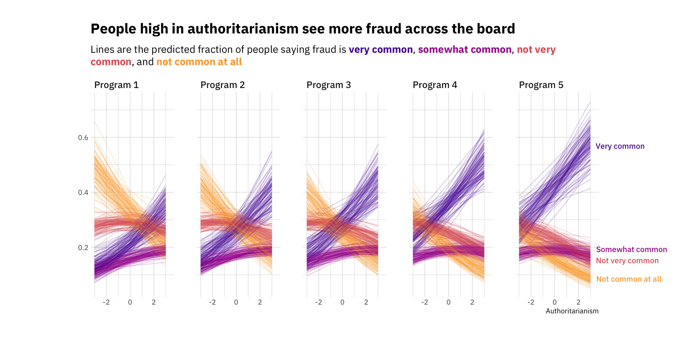
First, I’ll create the color palette. The viridis collection is always a good option, for a number of reasons, including robustness to colorblindness and also perceptual uniformity. Let’s use plasma, and get 4 different colors. You can play around with the begin and end values to pick a range that suits your needs. To make this cleaner, let’s also creating character vectors for the title and subtitle. Note that there’s some ggtext (see vignettes and documentation here code inserted within the character vector. This allows us to add Markdown notation to bold and italicize text. More importantly, it also makes it relatively easy to change colors!
# Defining our color palette. One color for every category.colors <-viridis(option ="plasma", begin =0.15, end =0.8, direction =-1, n =4)# Defining our title and subtitlemy_title <-c("People high in authoritarianism see more fraud across the board")my_subtitle <-c("Lines are the predicted fraction of people saying fraud is <span style = 'color:#5601A4FF;'>**very common**</span>, <span style = 'color:#A62098FF;'>**somewhat common**</span>, <span style = 'color:#DE5F65FF;'>**not very common**</span>, and <span style = 'color:#FCA636FF;'>**not common at all**</span>")# Plotting the fitted drawsp <- df_fitted %>%ggplot(aes(x = auth, y = .value, color = choice, # Don't forget the indices!group = indices)) +facet_wrap(~program, nrow =1) +geom_line(alpha =0.2) +scale_color_manual(values = colors) +# We won't need theseguides(color =FALSE,label =FALSE) +theme_ipsum_ps()
Warning: The `<scale>` argument of `guides()` cannot be `FALSE`. Use "none" instead as
of ggplot2 3.3.4.
p
Ok, we’re almost there. Time for the bells and whistles. Let’s add our title and subtitle using ggtext. Note that to use the extra formatting, you’ll have to add an element_textbox_simple() call wherever you plan to use it (in this case, the subtitle). We’ll also expand the plot margins to make space for our labels, and remove the limits using coord_cartesian(clip = "off"). Then we’ll add the labels, filtering the original data to make sure it only shows up once, towards the right hand side of the plot.
p +labs(title = my_title,subtitle = my_subtitle,x ="Authoritarianism",y =NULL) +# Note we extend the right margin to make space for our labels(the order is top, right, bottom, left)theme(plot.margin =margin(30, 100, 30, 100),# You'll have to add this element_textbox_simple call to make the formatting workplot.subtitle =element_textbox_simple(margin = ggplot2::margin(10,0,20,0),family ="IBM Plex Sans")) +# This allows any labels or data to go past the gridcoord_cartesian(clip ="off") +# Finally, our labels. We filter the data to avoid having a million of themgeom_text_repel(data = df_fitted %>%filter(program =="Program 5"& auth ==3) %>%# Keep just one of eachdistinct(auth, program, choice, .keep_all =TRUE),aes(label = choice), direction ="y", hjust =0, segment.size =0.2,# Move the labels to the rightnudge_x =0.4,na.rm =TRUE,# Expand limits so that the label doesn't get stuckxlim =c(-10, 10),# Use the theme_ipsum_ps() font familyfamily ="IBM Plex Sans Medm",# Adjust size as needed!size =3.5)
And there we go! Lots of wrangling later, here’s our final result. It’s not perfect, but I think it’s an interesting way to show both the uncertainty of the predictions as well as the effect of a continuous variable on the ordinal outcome (though note that this could easily work with a binary or ordered categorical variable too).